Your Brain Hates You
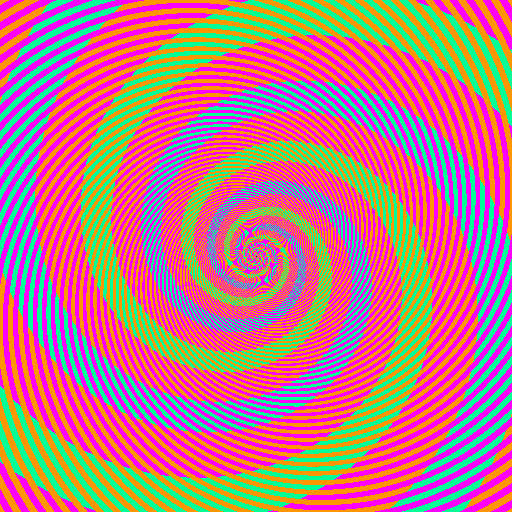
The "blue" and the "green" are identical colors (RGB 0/255/150). Discuss.

Yes, they are. Grab this image and test the colors yourself.
From Phil Plait, the Bad Astronomy blogger, who says:
The orange stripes go through the "green" spiral but not the "blue" one. So without us even knowing it, our brains compare that spiral to the orange stripes, forcing it to think the spiral is green. The magenta stripes make the other part of the spiral look blue, even though they are exactly the same color. [...]This is why I tell people over and over again: you cannot trust what you see even with your own eyes. Your eyes are not cameras faithfully taking pictures of absolute truth of all that surrounds you. They have filters, and your brain has to interpret the jangled mess it gets fed.
In other words, your brain hates you.


Comments
You just blew my mind. That was a great optical illusion. :)
Posted by: Duncan | June 25, 2009 7:20 AM
Hates?
Not the way I would have put it. My brain is a very sophisticated information processing system. It is not, however, a computer.
Computers know that both green and blue stripes are 0/255/150. What they don't know is that one of them is green and one of them is blue. Or that the image is pleasing to look at it. Or that it is amusing to find one stripe green and one stripe blue knowing that they are the same RGB value.
As for not being able to trust what you see with your own eyes, define "trust", and define "see". Those stripes are green and blue. I see that, and I trust that. It matters not at all to me that the RGB values are the same. Why do you think the RGB values are more "real" than your perception of the colour stripes in context? If you show that diagram to any other human, they will agree that they are blue and green. So what do you care what a computer would think of it?
It is very fashionable to talk about how our perceptions are somehow less "real" than some underlying "reality", because we do not always perceive what a machine would perceive in the same situation. But to mock your own brain as inadequate or (I know jokingly) complaining that it hates you, because it sometimes sees things differently to a crude & unthinking machine, that seems weird to me.
Machines do not understand anything about context or meaning. Sometimes that is a useful thing, when what you need to measure is some quality of reality that is unavailable to human perceptions because of our tendency to interpretation. But 99.99999% of the time what your brain sees in a scene is far more useful than what a camera sees - a camera sees only a matrix of numeric values. What your brain shows you is a latent visual database, with enormous amounts of information about every object in view available for instant recall, and summarized versions of that available without conscious thought just by looking.
OK, OK, I'm overarguing this, but I really don't like to be down on the brain like this, and I am dubious of the idea that what a camera or a computer sees should be considered to reflect more an underlying "reality" than what we see. In this case the pixels may have the same RGB value, but that description is inadequate without context, and the context says that one stripe is green and one blue. I would say the version with more context is more real.
Posted by: Jacob Davies | June 25, 2009 12:14 PM
This seems like a variant on the "recognize speech"/"wreck a nice beach" difficult AI problem again. Perception and reality diverge and context rules supreme.
Posted by: John B Stone | June 25, 2009 2:49 PM
Its extra fun to watch the colors change as you zoom in on the image.
There's also a similar gray scale illusion using chess boards. http://www.chessbase.com/puzzle/puzz10b.htm
Philosophers have known that our perception of the world is error prone for thousands of years.
That's what eventually led us to empiricism and later the scientific method.
Posted by: Diane Trout | June 25, 2009 3:25 PM
Josef Albers would be happy to show you a whole plethora of such color illusions in much less garish colors.
I'll pass this on to a friend at RISD who is working with a Brown Univ psychologist on the art and science of optical illusions.
Posted by: gmoke | June 25, 2009 7:25 PM
Psychedelic.
OK, I’d like to take a step back from “error” -- because that’s not really the point. You are perceiving the color differently based on it’s context. That is part of the point that Jacob makes quite nicely above.
If you want a flashback to undergraduate anthropology classrooms, check out the Sapir-Wharf Hypothesis and the Berlin-Kay Tests around cultural univerals (and differences) of color perception and naming.
A classic example that actually works quite nicely here comes from Japanese, where both these colors we are distinguishing here as “blue” and “green” would be called “aoi,” generally translated as “blue.” The word “midori,” generally translated as “green,” is usually applied to things that we perceive as green but that occur in contexts of nature: plants etc.
If anybody lurking around here has new/nuanced knowledge of neurolinguistics and/or linguistic relativism, please chime in.
Posted by: Miriam | June 25, 2009 11:20 PM
Jacob...fantastic post.
I'm with you...couldn't agree more.
Posted by: Josh Stack | June 26, 2009 12:36 PM
If you look at the very edges of the images, the colors look more similar.
Posted by: Jay | June 26, 2009 4:30 PM
When I zoomed in on the image in PhotoShop it was obvious the "green spirals were the same" Zooming out I discovered my eyes were compromising the hues relative to the adjacent color. Having the ability to "compromise" wired into our brains means...um...er something compared to ah something else. Don't know where I was going with that.
Posted by: Mike Woolsey | August 4, 2009 8:13 AM